Satisfied with our results, we now knew that our branding was pointed in the right direction and that we could, finally, start designing our User Interface.
Style Tile
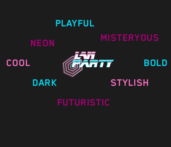
For our Style tile we took what we already established: the combination of steampunk and 80’s nostalgia. And added elements from a new video game call “Cyberpunk 2077”, both “Blade Runner” movies and a netflix series called “Altered Carbon” We used blue’s and pinks since they complement each other and are common colors in neon/ 80’s themes. And then to lean in to a more cyberpunk feel the typography we utilized was Blender Pro.

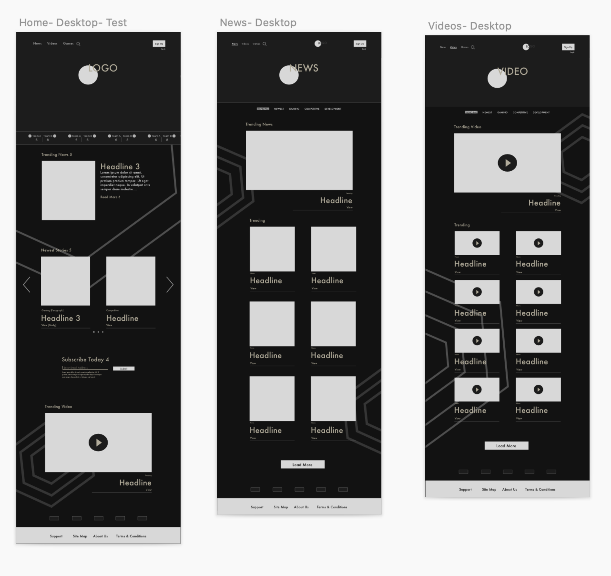
High-Fidelity Wireframes
For our Hi-Fi Wireframes we went ahead and designed for desktop, tablet and mobile.

Stage 5. Prototype
The prototype was developed for desktop and we will love if you could test it out:
Here
Next Steps
- For next steps we want to user test our high-Fi prototypes to be able to correct any issues our prospect user may have navigating our solution
- We would also like to explore our site to include information on competitive players, live streams and even tackle features we did not have time to do in Our MOSCOW chart.
EXTRA
As an extra deliverable, we designed the Hi-Fi to be responsive in Ultra-Wide.
For Ultra-Wide, we came up with the concept that the articles and news would be displayed all on one page, and navigation would be done using WASD on your keyboard:

If you’d like to see the prototype for ultra-wide you can check it out
here.
A special thank you to my partner in this project: Robert Zamora and thank you for reading!