Access
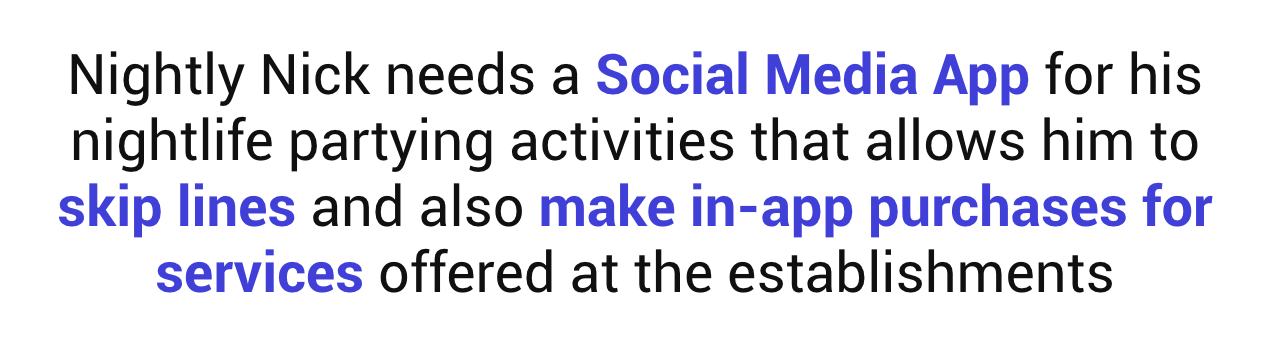
"User research and Ideation concept for a Social Media Clubbing app"

Challenge: Design a nightclub app directed to meet the needs and goals of users found on the discovery stage.
My Role: Research, Ideation Sketching, Wire-framing, Prototyping and UI.
My Client: Access (fictional)
Timeline: 5 weeks
Stage 1. Discovery

Early Assumptions
To begin the stage of discovery I needed somewhat of a starting point, for this I took my own experience going out to nightclubs and bars an came with the following assumptions that will need to be ratified:
- Doing big lines outside an establishment its something expected but still a pain-point to users (wait times can be really long)
- Final charges and bottle pricing can be confusing as they are unexpected fee's
- Most places use the service of promoters
- Some users main reason to go to an establishment is to look for potential partners
- Most of the times you have to pay an entrance fee and then later pay for drinks
- Most Dj’s don’t take song requests
Survey
Now that I had some early assumptions it was time to corroborate them, to do this I proceeded to create a survey. All with hopes of understanding and empathizing better with Potential Users.
Some of the biggest insights were:
- 71 % of potential users main reason to go to establishments is to have fun with friends
- 76 % of potential users pointed that long waiting lines were there biggest issues when going out to an establishment
- 81 % of potential users selected "knowing if there is any fee to get in an establishment" as the must important piece of information to know before going out
- 52% of potential users Spent between $50 to $100 on average in a night out
- 40% of potential users go to establishments at least one or twice a month
Interviews
After collecting the biggest takeaways of the survey, I was left with some room and points to explore; Wanting to dig deeper in order to understand better potential users I went ahead to do interviews in hopes of obtaining detailed qualitative data
Affinity Diagram
Once the interviews were done, I went ahead and grouped my findings based on similarities that users may have experienced regarding this topic:
Business Competitor Analysis and Blue Ocean
Now that we knew who our potentials user were, their needs and their pain-points; Now it was time to review the market and look at what the competition was offering and how they were doing it so.
To do this we proceed to do business research on each one; Then we took our findings and compare our rivals on criteria based on brand, features offered and value preposition to users. While doing this step a thought started to invade my mind: Some of this Apps offered great solutions to some of the problems i have discovered on this stage, why is this the first time i hear of them? why aren't they more popular / Mainstream? When it hit me...
Going to a establishment is a Social activity!
Our Surveys and Interviews made it clear, most potential users pointed that they go out to either meet new people or have a good moment with their friends. Based on this discovery, i was able to find a big gap on the market (Blue Ocean) that could provide our solution a competitive edge in the market
This market position is based on two axes, Type of events offered: only clubbing/partying or broad, and social media adaption: full or not.
As shown on the map, the solution was placed as more focused on clubbing but also as a full social media app.
Stage 2. Define

How Might We Statements
To start defining our problem, we began by creating some “how might we statements” based on the uncover user needs found on the discovery stage:
User Persona
Then with those in mind, I proceeded to create a User Persona, User Personas are fictional characters that we designers built based on the insights found on the discovery stage. Developing personas helps us avoid designing generic solutions or focusing on too broad audiences

User Journey
A user journey is the current experience our user persona is having when going out to an establishment without interacting with our solution. It describes at a high level of detail exactly what steps our user takes to complete a task. It also shares his emotional state along with his actions..
Problem Statement
To conclude the Defining stage, it was finally time to define our main objective.
Stage 3. Ideation

Now with the problem defined, it was finally time to ideate our possible solution.
Brainstorming
Finally, it was time to start ideating a solution, for this I started listing all things that will be needed to solve our “How Might We’” and problem statements, always keeping in mind the user needs, wants, and pain points.
Moscow Method
After a brainstorming possible solutions, MoSCoW Method was used in order to understand what features are most important and what features are not. This helps us as designers to understand what are our priorities at the moment of ideating a solution .
MVP
After Finishing Prioritization, an MVP helps summarize what our product will do and how it will help our user's address its paint points.

Userflow
A user flow is the visual representation of the many avenues that can be taken when using an app or website in order to fulfill a task.
We do this to empathize with users and understand their journey through our solution:
Sketches
Now that we have a solid concept of what was needed and how should we provide it, it was finally time to start sketching our solution:
Mid-Fidelity Wire-framing
Mid-Fi Wireframes are created on a computer program (it can be sketch, Figma, adobe xd, etc). They are black and white or unicolor and they pretty show us how potential users can interact with our propose solution and it such solution provided will actually work.

Mid-Fidelity Prototype
With our possible solution, it was time to try it out. We live test it on zoom with a total of 7 users, our test was as following: I did a small introduction about what the app is all about, then we requested the user to not think too much about it and just try to fulfill the following tasks as they see fit.
We then observe how the users interact with our prototype and depending on the interactions (both positive and negative). We ask them questions to understand their process and how they think.
Base on this feedback we came to the following Insights:
Qualitative Data Insights
- 90% of users said that the layout of the prototype was similar to other social media apps out there and was easy to navigate
- 100% of users said that the navigation bar was clear from the go and every icon was what's expected
- 100% of users said that the process to do in app purchases was simple and clear
Quantitative Data Insights
To measure the effectiveness of our solution, we asked three (3) different task from our users: 1) Login and choose their music preferences, 2) find an establishment or user and
3) be able to buy tickets or a bottle service for an evening.
- task 1. 100 % Of users were able to fulfill this task successfully
- Task 2. 71 % Of users were able to fulfill this task successfully
- Task 3. 100 % Of users were able to fulfill this task successfully
For task number two (2), 29 % of our users had a hard time finding a user or a nightclub as they did not understand what category was the search bar referring too... To fix this we proceeded to add a filter on top that will help users differentiate between searches.
Stage 5. User Interface

Visual Competitor Analisys
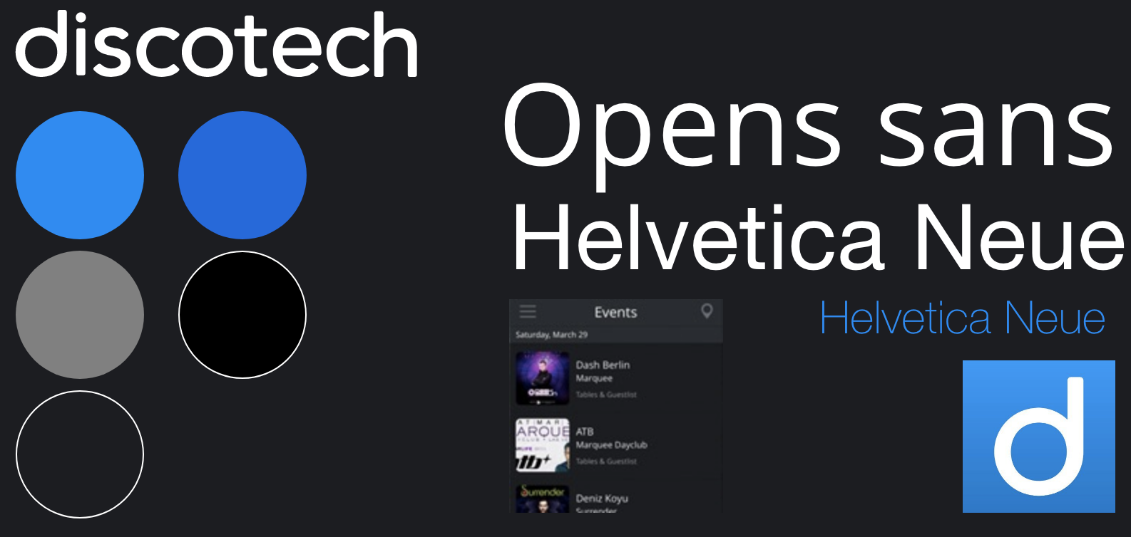
To start the UI stage, A visual competitive analysis of one our competitors was in order. We broke down their colors, typography, and UI elements; The items that established their branding/ mood. For competitors I went with the biggest one (best established) "Discotech". We do this to understand the elements that compose our competitors website
Brand Attributes
Now that I knew and understood what Elements compose our competitors UI, it was finally time to select what elements were needed on our own solution. To start this some brand attributes that were desire for the brand were selected:
Mood-Board
With brand attributes done, it was time to create a mood board, it was put together based on these attributes and what we wanted the overall aesthetic to be . something easy going but eye catching and overall exciting
Style Tile
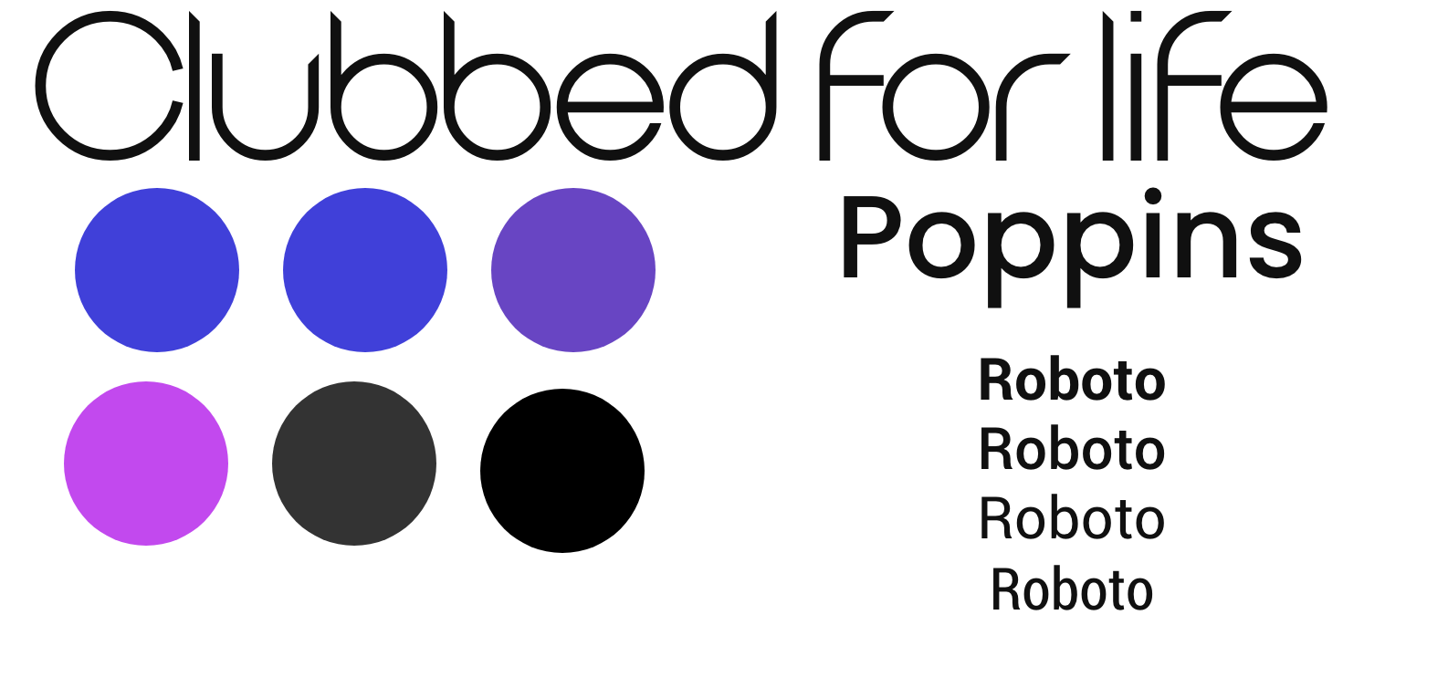
For the Style tile I took what we already established on the mood-board and translate it to elements, that we will use the define our User Interface Style in our High-Fidelity Wireframes. On colors, I went for a gradient combination of blue and purple tones that i will later combine with both white and a dark blue. For font-type I went ahead and use two sans-serif fonts (Poppins for tittles and Roboto for the body), this fonts convey simplicity but also modernity.
High-Fidelity Wireframes
The prototype was developed on Adobe XD and I will love if you could test it out:
Link to prototypeNext Steps
- Ideate Promoter profile, as we believe it can be key for our success at an early stage
- Create a reward system for loyal users to increment engagement metrics
- Create a referral reward system for those who invites friends and families to the apps to increase growth metrics
Extra Steps
As an extra step i decided to go ahead and try out how a dark-mode version will look, if you want to test it out on the prototype... please go to the menu located on the left side (hamburger menu) and click on the lightbulb icon on the lower left end.
A special thank you to my Instructor Snezana Dragusev and my Ironhack Cohort for their kind advices on the UI stage and thank you for reading!


